Streamlining Mobile Interfaces with the Setting Adjustments UI Elements Kit
There is a specific kind of frustration that comes with designing a mobile application's settings page. It is often treated as an afterthought, a graveyard for toggles and sliders that don't fit anywhere else in the user flow. Yet, for the end-user, this is where they exert control over their experience. When these elements look disjointed, feel unresponsive, or clash with the app's aesthetic, it erodes trust. This is precisely where a dedicated resource like the Setting Adjustments UI Elements Kit becomes invaluable. It isn't just a collection of icons; it is a cohesive system designed to bring order and polish to one of the most critical parts of any digital product.
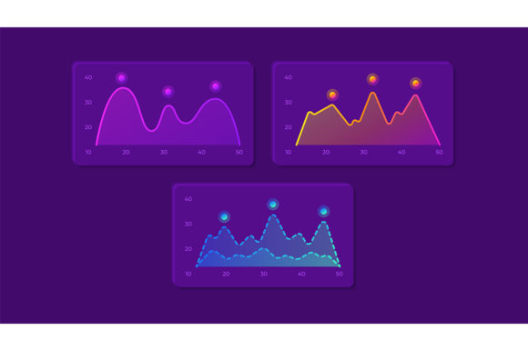
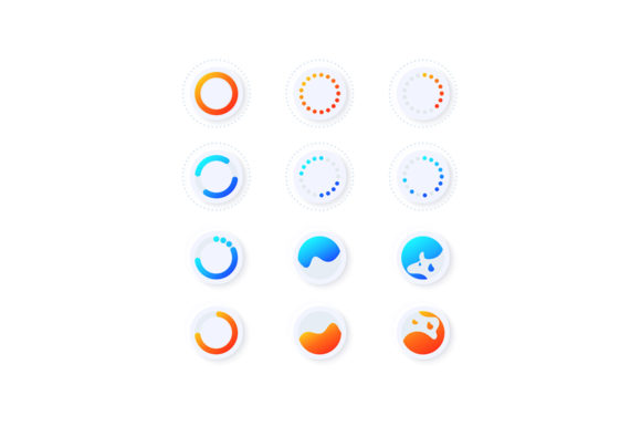
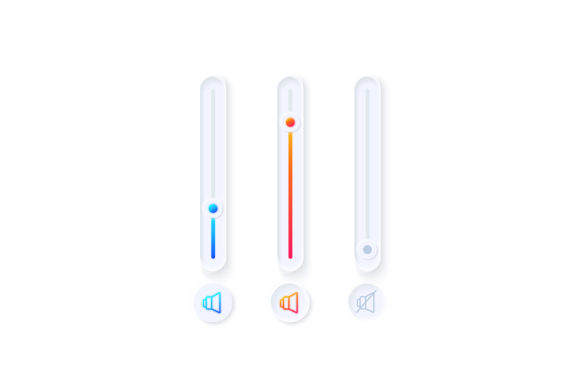
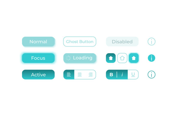
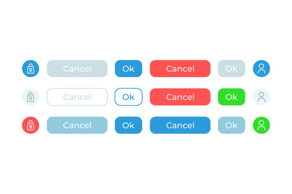
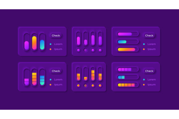
The core appeal of this kit lies in its specialization. While general UI libraries offer a broad range of components, they often lack the nuance required for complex configuration screens. The Setting Adjustments UI Elements Kit focuses specifically on option controls, isolated vector icons, bars, and dashboard templates tailored for modern mobile applications. What sets it apart immediately is the inclusion of a fully realized dark theme interface. In an era where users spend hours staring at screens, offering a high-quality dark mode isn't just a trend; it is a necessity for user comfort and battery efficiency on OLED devices.
Real-World Applications Across Industries
Consider the workflow of a fintech startup launching a new budgeting app. Their developers need to implement granular controls for notification preferences, currency settings, and data privacy options. Without a pre-built kit, a designer might spend days crafting individual toggle switches that look slightly different from the sliders used elsewhere. By utilizing the Setting Adjustments UI Elements Kit, the team can instantly deploy a consistent visual language. The kit's bar and dashboard templates allow them to visualize spending limits or transaction histories directly within the settings area, turning a static configuration page into an interactive dashboard.
In the health and wellness sector, the utility shifts slightly but remains equally critical. A meditation or fitness tracking app requires precise adjustments for goal setting, reminder frequencies, and metric displays (like heart rate zones or sleep cycles). The isolated vector icons included in the ZIP file—available in EPS, AI, SVG, PNG, and JPG formats—allow designers to pick specific symbols that resonate with health metrics without needing to redraw them from scratch. Because these are vectors, they scale perfectly whether the app is viewed on a compact smartphone or a larger tablet, ensuring that a "calories burned" icon looks crisp on any resolution.
Even in the gaming industry, where immersion is paramount, settings menus can break the spell if they look generic. Game developers often struggle to balance functionality with style. This kit provides a foundation that can be customized. The dark theme interface serves as an excellent starting point for gaming apps, reducing eye strain during night sessions. Developers can take the provided option controls and tweak the colors to match their game's branding while retaining the underlying logic and usability patterns that users already understand.
The Advantage of Format Versatility
One of the most practical aspects of this collection is the sheer variety of file formats provided. Designers and developers rarely work in a single ecosystem. A UX designer might be working in Adobe Illustrator to create custom variations, while a frontend developer needs SVG code to ensure lightweight loading times in the browser or app. The fact that the Setting Adjustments UI Elements Kit includes EPS, JPG, PNG, SVG, and AI files means there is no friction in the handoff process.
For instance, if a marketing team needs to create a screenshot for the App Store showcasing the new "Dark Mode" feature, they can grab the high-resolution PNGs or JPGs directly from the kit to mock up promotional materials. Meanwhile, the engineering team can integrate the SVGs, which are resolution-independent and typically smaller in file size, ensuring the app remains performant. This flexibility eliminates the common bottleneck where designers have to export assets in multiple formats manually, speeding up the entire production timeline.
Navigating the Dark Theme Landscape
Implementing a dark theme is trickier than simply inverting colors. It requires careful attention to contrast ratios, elevation, and color saturation to ensure readability and accessibility. The Setting adjustments UI elements kit addresses this by providing a pre-calibrated dark theme interface. The designers behind this kit have likely already tested various shades of gray and accent colors to meet WCAG (Web Content Accessibility Guidelines) standards.
This is particularly helpful for teams that lack a dedicated accessibility expert. Instead of guessing whether a light gray text on a dark gray background is readable for users with visual impairments, you can rely on the established hierarchy within the kit. The dashboard templates included demonstrate how to layer information effectively in low-light environments, using subtle borders and shadows to define sections without relying on stark white lines that can cause glare.
Strategic Considerations Before Implementation
While the benefits are clear, adopting a UI kit requires a strategic approach. It is tempting to drop these elements into your project and call it a day, but context matters. The Setting Adjustments UI Elements Kit is robust, but it should be viewed as a foundation rather than a rigid constraint. Before integrating these elements, consider your brand's unique voice. Does the standard toggle switch align with your playful brand personality, or does it need a rounded corner adjustment? Do the dashboard bars need to reflect your specific data visualization style?
Another consideration is the scope of your application. If you are building a minimalist tool with only three settings, importing a full dashboard template might be overkill. However, for complex enterprise applications or feature-rich consumer apps, the depth of this kit pays off immediately. It ensures that as you add more features over time—perhaps a new "Privacy" section or an advanced "Audio" mixer—you have a scalable system ready to accommodate them without breaking the visual consistency.
It is also worth noting the importance of platform guidelines. While this kit offers excellent web design widgets for mobile applications, always cross-reference the components with Apple's Human Interface Guidelines and Google's Material Design principles. The kit provides the aesthetic building blocks, but the interaction logic (how a slider feels when dragged, how a toggle animates) still needs to be implemented according to the native platform standards to ensure the app feels "at home" on the user's device.
Enhancing the Developer-Designer Handoff
Perhaps the most underrated value of a comprehensive kit like this is how it improves communication between designers and developers. Ambiguity is the enemy of efficient development. When a designer sends over a custom-drawn slider that doesn't have specified states (hover, active, disabled), the developer has to make assumptions. The Setting Adjustments UI Elements Kit mitigates this by providing a complete set of states and variations. The option control isolated vector icons come with clarity that leaves little room for interpretation.
This shared vocabulary allows teams to move faster. Instead of debating the pixel width of a progress bar, the team can refer to the specific component in the kit. This alignment reduces revision cycles and allows the team to focus on higher-level problems, such as user flow optimization and feature logic, rather than getting bogged down in pixel-perfecting basic UI elements.
Ultimately, tools like the Setting adjustments UI elements kit represent a shift towards smarter, more efficient design workflows. They acknowledge that while creativity is essential, reinventing the wheel for every standard interface element is not the best use of talent. By leveraging these high-quality, versatile, and dark-mode-ready resources, creators can build applications that feel polished, professional, and intuitive from the very first launch.