Mastering Mobile Settings with the UI Elements Kit
Designing a seamless settings interface is often the most overlooked aspect of mobile application development, yet it serves as the control center for user trust and satisfaction. When users navigate to the settings menu, they are looking for clarity, control, and immediate feedback. A cluttered or ambiguous interface here can lead to frustration, increased support tickets, and ultimately, app abandonment. This is where a specialized resource like the Setting Choices UI Elements Kit becomes an invaluable asset for designers and developers aiming to elevate their product's usability without reinventing the wheel.
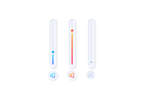
The core value of this kit lies in its ability to standardize the visual language of configuration options. It provides a comprehensive collection of activated and inactive isolated vector icons, bars, and dashboard templates specifically tailored for light theme interfaces. By utilizing pre-designed, high-fidelity components, teams can bypass the tedious process of drawing individual toggles, sliders, and radio buttons from scratch. Instead, they can focus on the logic and flow of the user experience, ensuring that every interaction feels intuitive and responsive.
Accelerating Workflow with Vector Precision
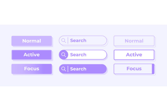
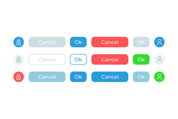
One of the most significant advantages of adopting the Setting Choices UI Elements Kit is the dramatic reduction in production time. In a typical design sprint, creating a consistent set of interactive states for various settings—such as notifications, privacy controls, and display preferences—can consume hours of a designer's schedule. Each element must be drawn in multiple states: default, hover, active, inactive, and disabled. Ensuring pixel-perfect alignment across these states requires meticulous attention to detail.
This kit resolves those bottlenecks by providing ready-to-use assets in versatile formats including EPS, JPG, PNG, SVG, and AI. The inclusion of vector formats like SVG and AI is particularly critical for modern mobile design. Vectors ensure that icons and interface bars remain crisp and sharp regardless of the screen density, from standard smartphones to high-resolution tablets. Designers can import these files directly into tools like Adobe Illustrator, Sketch, or Figma, modify colors to match brand guidelines instantly, and scale elements without any loss of quality. This flexibility allows for rapid prototyping, enabling teams to test different layout configurations and user flows much faster than if they were building components manually.
Enhancing User Clarity Through Visual Consistency
Consistency is the bedrock of good user interface design. When a user interacts with a toggle switch in one section of the settings menu, they expect the same visual behavior and style when interacting with a slider in another section. Inconsistencies in stroke weight, icon style, or color usage can create cognitive friction, making the app feel unpolished or unreliable. The Setting Choices UI Elements Kit enforces a unified design language across all configuration elements.
Consider the distinction between activated and inactive states. In a light theme interface, subtle differences in color saturation, shadow depth, and iconography are required to clearly communicate status without being distracting. This kit offers isolated vector icons and bars that are meticulously crafted to provide clear visual cues. For instance, an "activated" toggle might feature a vibrant accent color and a solid checkmark, while the "inactive" state utilizes a neutral gray with a hollow outline. These nuanced details help users understand the current state of their preferences at a glance, reducing the likelihood of errors and increasing confidence in the application.
Optimizing for Light Theme Interfaces
While dark mode has gained popularity, the light theme remains the default and most widely used interface style for many productivity and utility applications. Designing for light themes presents unique challenges, particularly regarding contrast and hierarchy. Elements must stand out against a white or off-white background without appearing heavy or cluttered. The web design widget collection included in this kit is specifically optimized for light theme environments.
The templates utilize appropriate shadow depths and border definitions to create separation between different setting groups. This is essential for dashboard templates where multiple categories of settings need to be organized logically. By using these pre-optimized widgets, designers avoid the common pitfall of low-contrast elements that become invisible on bright screens. The result is a clean, airy interface that feels professional and easy to navigate, which is crucial for retaining users who spend significant time configuring their app experience.
Practical Applications for Diverse Roles
The utility of the Setting choices UI elements kit extends beyond just UI designers. Freelancers and small business owners developing their own apps can leverage these assets to achieve a polished look that rivals enterprise-level software, all without the budget for a dedicated design team. Marketers and product managers can use the dashboard templates to create high-fidelity mockups for stakeholder presentations or crowdfunding campaigns, effectively communicating the product's functionality before a single line of code is written.
For educators and tutorial creators, having access to standardized, high-quality UI elements allows for the creation of clearer instructional materials. When teaching students about mobile interface design, using consistent and professional components helps illustrate best practices more effectively than rough sketches or inconsistent screenshots. Similarly, bloggers and publishers reviewing mobile trends can use these visuals to enhance their articles, providing readers with concrete examples of good design principles in action.
Technical Flexibility and Integration
A major consideration when selecting design assets is compatibility with existing workflows. The fact that the ZIP file contains EPS, JPG, PNG, SVG, and AI ensures that the kit integrates smoothly into virtually any design or development pipeline. Developers often prefer SVG for direct implementation in code due to its small file size and scalability, while designers might work primarily in AI or EPS for detailed editing. The inclusion of raster formats like PNG and JPG ensures that these elements can also be easily used in documentation, marketing materials, or presentations where vector editing is not required.
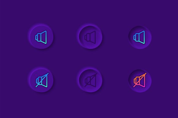
Furthermore, the isolated nature of the vector icons means they can be easily animated. In modern mobile applications, micro-interactions play a huge role in perceived performance. When a user flips a switch, a subtle animation confirms the action. Because the icons in this kit are vector-based and separated by state, animators can easily interpolate between the "active" and "inactive" versions to create smooth transitions, enhancing the overall tactile feel of the application.
Making Informed Design Decisions
While the Setting Choices UI Elements Kit offers substantial benefits, it is important to consider how it fits into your specific project requirements. If your application relies heavily on a highly customized, avant-garde aesthetic that deviates significantly from standard material design or iOS human interface guidelines, you may need to modify these base elements extensively. However, for the vast majority of applications that prioritize usability and familiarity, these templates provide a robust foundation.
It is also worth noting that while the kit focuses on light theme interfaces, the vector nature of the files makes them adaptable. With simple color swaps in a vector editor, these elements can often be inverted for dark mode implementations, though care must be taken to ensure contrast ratios remain accessible. Users should always test the final implementation on actual devices to ensure that the visual hierarchy translates well across different screen sizes and lighting conditions.
Ultimately, the goal of any design tool is to empower creators to build better products more efficiently. By handling the intricate details of toggle states, icon consistency, and dashboard layouts, the Setting Choices UI Elements Kit frees up mental energy for solving higher-level user experience problems. Whether you are a seasoned professional refining a complex enterprise dashboard or an entrepreneur launching your first mobile utility, having reliable, high-quality UI components at your disposal can make the difference between a functional app and an exceptional one.
In a competitive digital landscape, the details matter. The settings menu may seem like a backend utility, but it is a frontline touchpoint for user control. Leveraging a dedicated kit ensures that this critical part of your application communicates reliability and professionalism, fostering a deeper connection with your audience and supporting your long-term goals for user retention and satisfaction.