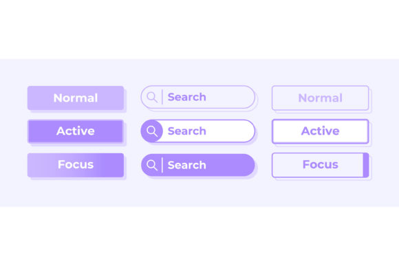
Mastering User Clarity with Active and Inactive Options UI Elements
In the fast-paced world of mobile application development, the difference between a frustrated user and a loyal customer often comes down to subtle visual cues. When you are building a dashboard template or refining a settings menu, the clarity of your interface dictates how easily users can navigate your product. This is where Active and Inactive Options UI Elements become critical. These are not merely decorative buttons; they are the silent guides that tell users what is possible, what is currently selected, and what is out of reach. Whether you are a freelancer designing for a startup or an entrepreneur launching your own tool, understanding how to effectively deploy these elements can save you from costly redesigns and poor user retention.
Many designers and developers, especially those new to mobile interfaces, treat state changes as an afterthought. They focus heavily on the "active" state—the bright colors, the bold icons, the engaging animations—while neglecting the "inactive" state. This imbalance creates a confusing experience. A user looking at a search tab isolated vector icon might not realize it is disabled if the contrast is too low or the visual weight is identical to the active version. The result? Users tap repeatedly on non-functional areas, leading to frustration and a perception that the app is broken. To avoid this, you must view inactive states not as empty space, but as essential communication tools that manage user expectations.
Common Pitfalls in State Design and How to Avoid Them
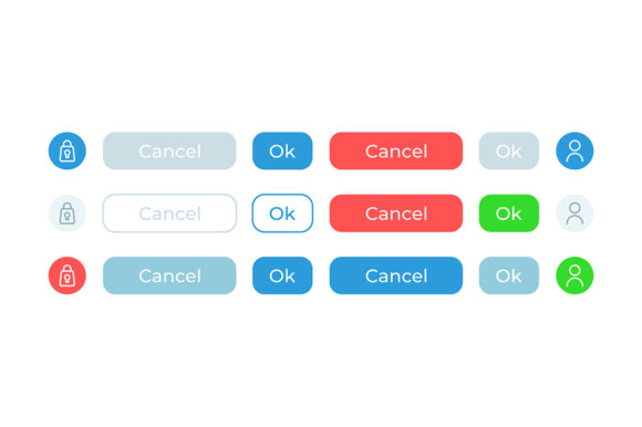
One of the most frequent mistakes when implementing an Active and inactive options UI elements kit is relying solely on color to denote status. While color is powerful, it is not accessible to everyone. Users with color vision deficiencies may struggle to distinguish between a green "on" toggle and a gray "off" toggle if there is no difference in shape, position, or label. Furthermore, in a light theme interface, using light grays for inactive items can make them disappear entirely against the white background, rendering the interface unusable. Instead of just fading opacity, consider adding structural changes. For instance, an inactive button might have a flat design while the active one has a slight shadow or border, providing a tactile cue that works regardless of color perception.
Another overlooked detail is the consistency of interaction feedback across different file formats and platforms. When you download assets in JPG, EPS, PNG, SVG, or AI formats, ensure that the vector scalability matches your deployment needs. A common error occurs when a designer uses a rasterized JPG for an icon that needs to scale across various mobile screen densities. The result is pixelation that makes the active state look unprofessional and the inactive state look muddy. Always prioritize SVG or AI files for icons like the search tab or dashboard bars. These vector formats ensure that whether the element is active or inactive, the edges remain crisp, maintaining the high-quality presentation your brand deserves.
The Impact of Poor Contrast and Visual Hierarchy
Imagine a user navigating a complex dashboard template filled with data widgets. If the active tab blends too much with the inactive tabs, the user loses their sense of place. They may scroll endlessly, unsure of which section they are viewing. This lack of clear hierarchy affects efficiency and satisfaction. In a professional setting, this confusion can lead to data entry errors or missed notifications. The solution lies in establishing a robust visual hierarchy before you even open your design software. Decide clearly: How much darker should the active text be? Should the active icon fill with color while the inactive one remains an outline? Stick to these rules rigidly throughout the web design widget collection.
It is also vital to consider the context of the settings menu. Users often enter settings to change a specific configuration and then leave immediately. If the active option isn't immediately obvious, they may change the wrong setting or exit without completing their task. A practical approach is to use a combination of color and positioning. For example, in a list of options, the active item could have a distinct background pill shape, while inactive items sit transparently. This creates a clear "container" for the current selection, guiding the eye naturally without requiring intense cognitive effort from the user.
Evaluating Kits and Assets Before You Commit
When shopping for a Active and inactive options UI elements kit, do not be swayed solely by the preview images. Marketing visuals are often idealized and may not reflect how the elements perform in a real-world mobile application. Before purchasing or downloading, check the file organization. Are the layers named logically? Is the search tab isolated vector icon truly isolated, or is it grouped with background noise that will complicate your workflow? A well-organized AI or EPS file can save hours of cleanup time, whereas a messy file can introduce bugs into your code later.
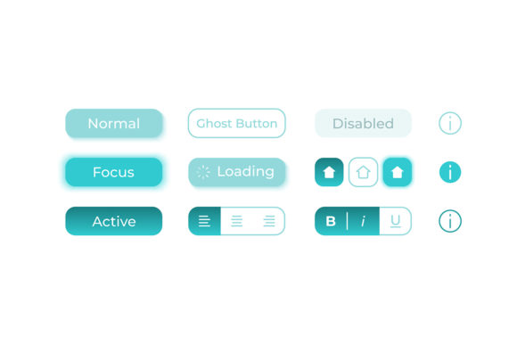
Additionally, verify the versatility of the kit. Does it offer enough variations to cover edge cases? For instance, does the kit include states for "hover," "pressed," "disabled," and "focused"? Many beginners overlook the "focused" state, which is crucial for accessibility and keyboard navigation. Without it, users who rely on assistive technologies cannot navigate your app effectively. A comprehensive kit will provide all these variations, ensuring your light theme interface remains inclusive and functional for all audiences.
- Check Scalability: Ensure the icons look sharp on both small phone screens and large tablets.
- Test Contrast: Verify that inactive elements still meet minimum contrast ratios against the background.
- Review File Types: Confirm the package includes editable vectors (SVG, AI, EPS) alongside ready-to-use rasters (PNG, JPG).
- Assess Consistency: Make sure the stroke width and corner radius match your existing design system.
Practical Steps for Implementation
To implement these elements successfully, start by mapping out the user journey. Identify every point where a user makes a choice. For each choice, define what the "before" (inactive) and "after" (active) states look like. Use your dashboard template as a testing ground. Place the bar charts and widgets side by side and step back. Can you instantly tell which one is selected? If not, increase the contrast or add a visual marker like a checkmark or a colored underline.
Remember that simplicity often wins. You do not need complex animations to indicate a state change. Sometimes, a simple shift in font weight from regular to bold is enough to signal activity. This approach reduces the load on the device's processor, improving the app's performance and battery life—a detail that tech-savvy users and professionals deeply appreciate. By focusing on clarity, accessibility, and performance, you transform a standard web design widget collection into a powerful tool that enhances user experience.
Ultimately, the goal is to create an interface that feels intuitive. When users interact with your settings or search functions, they should feel confident in their actions. By avoiding the traps of poor contrast, inconsistent formatting, and inaccessible design, you ensure that your Active and Inactive Options UI Elements serve their true purpose: guiding users smoothly toward their goals. Take the time to evaluate your assets, test your states, and refine your hierarchy. The effort you put into these details today will pay off in user satisfaction and professional credibility tomorrow.