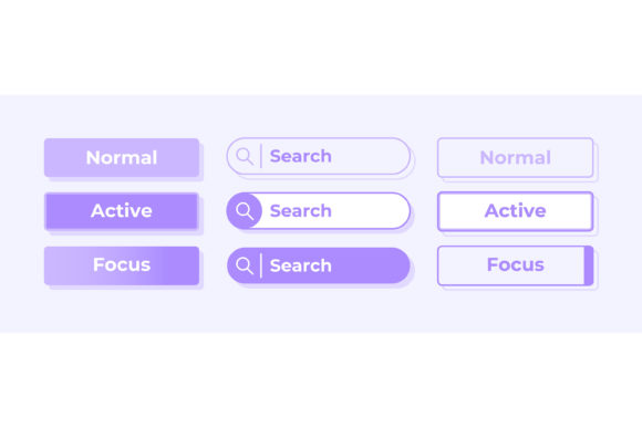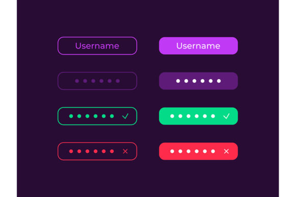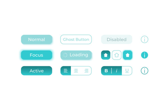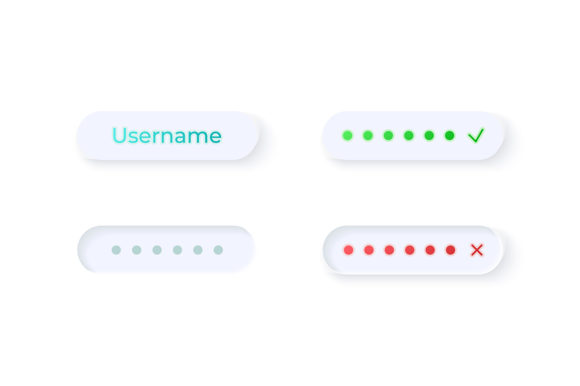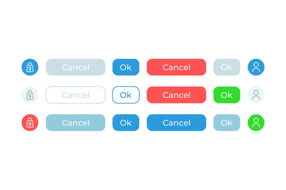
Streamlining User Decisions with the Confirm Options UI Elements Kit
Every time a user clicks "Delete Account," "Submit Order," or "Save Changes," they stand at a digital crossroads. These moments of decision are critical. If the interface is confusing, users hesitate, make mistakes, or abandon the process entirely. This is where a well-crafted Confirm Options UI Elements Kit becomes indispensable for anyone building digital experiences. It isn't just about having an OK and Cancel button; it is about providing clarity, reassurance, and a seamless flow that respects the user's intent.
In the fast-paced world of web and mobile design, reinventing the wheel for every dialog box is inefficient. Designers and developers often find themselves tweaking pixel values, debating shadow opacities, or struggling to align text within a modal window. A dedicated collection of confirm options UI elements solves this by offering a pre-designed, cohesive set of assets. Whether you are a freelancer rushing to meet a deadline, a startup founder prototyping a new app, or an educator creating interactive courseware, having these ready-made components allows you to focus on the logic of your application rather than the aesthetics of a simple button.
Why Clarity Matters in Critical Interactions
Imagine you are managing inventory for a small business using a mobile dashboard. You need to remove an outdated product listing. If the confirmation prompt looks like an error message, you might panic and hit "Cancel," leaving the clutter there. Conversely, if the "OK" button is indistinguishable from the "Cancel" button, you might accidentally delete something vital. The psychology of these interactions is subtle but powerful.
A high-quality Confirm Options UI Elements Kit addresses this by using visual hierarchy effectively. Typically, the primary action (like "Confirm" or "OK") is bold, colored, or prominently placed, while the secondary action ("Cancel") is subdued. This guides the eye and reduces cognitive load. When users feel confident that the interface understands their intent, trust in the platform grows. For marketers and business owners, this trust translates directly into higher conversion rates and fewer support tickets related to user errors.
Versatile Applications Across Industries
The utility of these UI kits extends far beyond standard mobile applications. Consider a blogger launching a membership site. They need a clean, light-themed interface where members can manage their subscriptions. When a member decides to upgrade or cancel a plan, the confirmation dialog must be friendly yet clear. Using a settings isolated vector icon alongside the text helps users instantly recognize the context—they are adjusting preferences, not encountering a system crash.
In the educational sector, teachers developing e-learning modules often need to confirm quiz submissions or assignment uploads. A confusing prompt here could cause a student to lose their work. By integrating a reliable bar and dashboard template element for confirmations, educators ensure that the technical side of learning remains invisible, allowing students to focus on the content. Similarly, hobbyists building home automation dashboards benefit from these kits. When confirming a command to lock the front door or turn off the heating, the interface must be unambiguous. A standardized kit ensures that whether the user is on an iPad or a smartphone, the experience remains consistent.
For entrepreneurs and creators selling digital products, the checkout process is the most sensitive area. A "Confirm Purchase" dialog that looks professional and secure can reduce cart abandonment. If the buttons look cheap or misaligned, it raises subconscious doubts about the security of the transaction. A polished web design widget collection provides that layer of professionalism without requiring a team of designers.
The Technical Advantage of Vector Assets
One of the most practical aspects of a comprehensive UI kit is the file format. Modern design workflows demand flexibility. A kit that includes EPS, JPG, PNG, SVG, and AI files covers every base. Vector formats like SVG and AI are crucial because they allow you to scale the buttons and icons to any size without losing quality. Whether you are designing for a high-resolution retina display on a new smartphone or a larger desktop monitor, the edges remain crisp.
PNG files with transparent backgrounds are perfect for quick implementation in code or prototyping tools like Figma or Adobe XD. They allow developers to drop the assets directly into the project structure. Meanwhile, JPGs serve well for presentations or documentation where transparency isn't needed but visual fidelity is. Having all these formats in a single ZIP file means you aren't hunting for converters or worrying about compatibility issues down the line. It streamlines the handoff between designer and developer, a common bottleneck in many projects.
Designing for Light Theme Interfaces
The current trend in user interface design heavily favors light themes, especially for productivity apps, dashboards, and commercial platforms. Light interfaces are perceived as clean, open, and easy to read in well-lit environments. A Confirm Options UI Elements Kit tailored for a light theme interface ensures that shadows, borders, and text colors have the correct contrast ratios.
Using dark-themed buttons on a light background without proper adjustment can look jarring and amateurish. A specialized kit takes the guesswork out of color theory. The buttons are likely designed with soft shadows and subtle gradients that pop against a white or off-white background, creating depth without clutter. This attention to detail is what separates a functional app from a delightful one. For small business owners who may not have a dedicated design team, starting with a kit that already adheres to these aesthetic standards is a massive time-saver.
What to Consider Before Implementation
While these kits offer immense value, users should approach them with a strategic mindset. First, consider the branding of your specific project. Even the best generic kit may need slight color adjustments to match your company's palette. Because the files are provided in editable formats like AI and EPS, this customization is usually straightforward, but it is a step you shouldn't skip. Consistency in branding reinforces recognition and trust.
Secondly, think about accessibility. While a kit may look beautiful, ensure that the contrast between the button text and the background meets WCAG guidelines. This is particularly important for educators and public-facing services that must be usable by people with visual impairments. The presence of clear labels and distinct visual cues in the OK and Cancel buttons helps, but verifying color contrast is a necessary due diligence step.
Finally, evaluate the context of use. Are you building a high-stakes financial app where warnings need to be red and urgent? Or a social media app where confirmations should be gentle and non-intrusive? The tone of the UI elements should match the emotional weight of the action. A good kit provides a solid foundation, but the final application requires human judgment to ensure the user feels respected and understood.
In conclusion, the Confirm Options UI Elements Kit is more than a folder of graphics; it is a toolkit for better communication between humans and machines. By reducing friction in critical decision points, enhancing visual clarity, and providing flexible technical assets, it empowers creators across all industries to build more effective, user-friendly digital products. Whether you are refining a complex dashboard or polishing a simple mobile utility, investing in quality UI components pays dividends in user satisfaction and operational efficiency.