Mastering Audio Control with the Video Sound Options UI Elements Kit
In the fast-paced world of mobile application development and web design, the user experience hinges on details that are often overlooked until they fail. Among these critical details is audio control. Whether a user is streaming a tutorial, watching a social media clip, or engaging with an interactive dashboard, their ability to manage sound is paramount. This is where the Video Sound Options UI Elements Kit becomes an indispensable resource for designers and developers. It is not merely a collection of icons; it is a comprehensive solution designed to streamline the integration of intuitive audio controls into dark-themed interfaces, ensuring that functionality meets aesthetic perfection.
The modern digital landscape demands more than just basic functionality. Users expect seamless interactions, immediate visual feedback, and interfaces that feel native to their devices. When a designer attempts to build these controls from scratch, they often face significant hurdles. The primary challenge lies in consistency. Creating a set of vector icons that look perfect at 24 pixels on a mobile screen and equally crisp on a high-resolution desktop dashboard requires precision. Furthermore, maintaining a cohesive design language across different states—such as muted, unmuted, volume sliding, and settings adjustments—can be time-consuming. The Video Sound Options UI Elements Kit addresses these pain points by providing a pre-engineered, professional-grade asset library that eliminates guesswork and accelerates the design-to-development workflow.
Overcoming Design Challenges in Audio Interfaces
One of the most common situations designers encounter is the "dark mode" dilemma. While dark themes are increasingly popular for their sleek look and battery-saving benefits on OLED screens, they present unique contrast challenges. White or light-colored icons can sometimes appear too harsh or suffer from halation effects if not properly weighted. Conversely, grey icons might disappear into the background. The Video Sound Options UI Elements Kit is specifically tailored for dark theme interfaces, offering optimized visibility and balance. This ensures that the mute audio button, music settings, and volume bars remain distinct and accessible without disrupting the immersive quality of the video content.
Another frequent goal for product teams is cross-platform compatibility. A widget that looks great in a mobile application might break when scaled for a web dashboard. The need for scalable vector graphics that retain their integrity across various resolutions is non-negotiable. By utilizing a kit that includes EPS, AI, SVG, PNG, and JPG formats, teams can ensure that their audio controls render perfectly whether they are embedded in a native iOS app, an Android interface, or a responsive web player. This versatility removes the friction of converting files and allows developers to focus on the logic of the audio engine rather than the aesthetics of the toggle switch.
Practical Applications and User Outcomes
The utility of the Video Sound Options UI Elements Kit extends far beyond simple playback controls. Consider a fitness application where users follow along with workout videos. In this scenario, the user needs to quickly mute the instructor's voice to listen to their own music playlist without leaving the screen. A clearly defined, isolated vector icon for muting allows for instant recognition and action. Similarly, in an educational platform, a student might need to adjust specific frequency bands or balance background music against narration. Here, the music settings isolated vector icon serves as the gateway to a complex equalizer, presented through a clean and uncluttered interface.
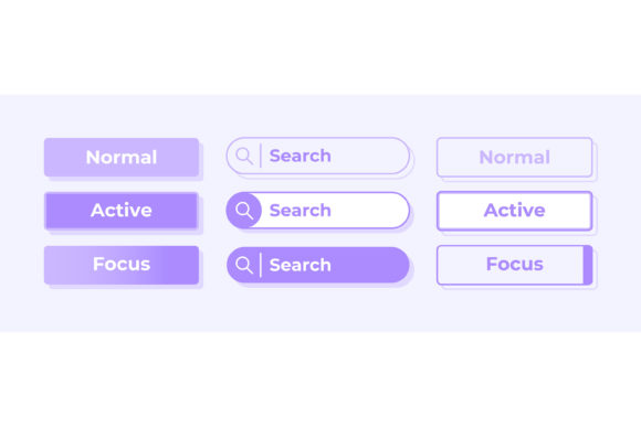
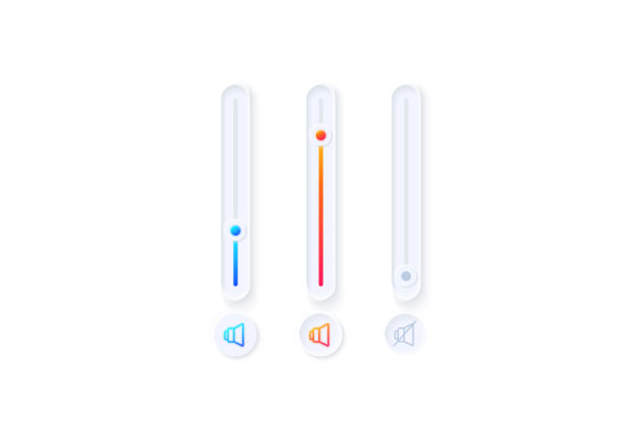
For dashboard templates used in content management systems or analytics platforms, the bar and dashboard elements included in the kit provide immediate visual context. A volume bar is not just a slider; it is a data visualization tool that indicates the current state of the system. When these elements are designed with a cohesive style, they reinforce the brand identity of the application. Users subconsciously trust interfaces that feel polished and intentional. By implementing the widgets from this collection, designers can elevate the perceived quality of their product, leading to higher user retention and satisfaction.
Tailored Approaches for Different Users
Different stakeholders approach the implementation of audio UI elements with varying priorities. For a UI/UX Designer, the focus is on the visual hierarchy and the interaction model. They value the SVG and AI files within the ZIP package because these formats allow for infinite scalability and easy modification of stroke weights or corner radii to match a specific design system. They can quickly prototype how the volume slider behaves during a hover state or how the mute icon animates when clicked, ensuring the micro-interactions feel fluid and responsive.
On the other hand, a Front-End Developer prioritizes efficiency and code readiness. They appreciate the PNG and SVG assets for their ease of integration into CSS sprites or direct HTML embedding. The fact that the Video Sound Options UI Elements Kit provides isolated icons means less time spent masking or cropping images in Photoshop. They can drop the assets directly into the codebase, confident that the alignment and spacing are already optimized for standard grid systems. This division of labor becomes smoother when both parties are working from the same high-quality source material, reducing the back-and-forth that often plagues design handoffs.
Product Managers and Business Owners also benefit from this resource, albeit indirectly. Their goal is time-to-market and cost reduction. By purchasing a comprehensive kit rather than commissioning custom icons for every single state of the audio player, they significantly reduce the budget allocated to graphic design hours. Furthermore, using a standardized kit reduces the risk of usability errors. A professionally designed mute button follows established conventions, reducing the learning curve for new users and minimizing support tickets related to "broken" audio controls.
Implementation Strategies and Recommendations
To get the most out of the Video Sound Options UI Elements Kit, it is recommended to establish a clear usage guideline before beginning the integration process. Decide early on whether the icons will be static or animated. If animation is required, the vector formats (EPS, AI, SVG) are essential, as they can be manipulated via CSS or JavaScript libraries like Lottie without losing resolution. For static implementations, such as in printed manuals or static mockups, the high-resolution JPG and PNG files offer convenience.
When designing for mobile applications, pay close attention to touch targets. Even though the icons in the kit are visually precise, the clickable area around them must be large enough to accommodate finger taps. Use the vector paths as a visual guide, but expand the interactive bounding box in your code to meet accessibility standards (typically at least 44x44 points). Additionally, consider the context of the bar and dashboard template. If the audio control is part of a larger control center, ensure that the visual weight of the volume slider matches other sliders, such as brightness or playback speed, to create a harmonious user interface.
Accessibility should also be a core consideration. While the Video Sound Options UI Elements Kit provides excellent visual cues, remember that not all users rely on sight. Ensure that every icon, from the mute toggle to the settings gear, is accompanied by appropriate ARIA labels in your code. This ensures that screen readers can accurately describe the function of each element, making your application inclusive for users with visual impairments.
Conclusion
The Video Sound Options UI Elements Kit represents more than just a download; it is a strategic asset for anyone involved in creating digital media experiences. By addressing the common challenges of consistency, scalability, and dark mode optimization, it empowers teams to build better products faster. Whether you are refining a mobile app's playback screen or constructing a complex web-based dashboard, having access to professional, isolated vector icons and widget collections allows you to focus on what truly matters: delivering a seamless and enjoyable experience for your users. In an era where user attention is scarce, the clarity and reliability of your interface can make all the difference.