Evaluating the Progression UI Elements Kit for Modern Interface Design
In the rapidly evolving landscape of digital product design, the efficiency of a workflow often hinges on the quality of available assets. Designers and developers frequently seek resources that bridge the gap between conceptualization and final implementation without compromising on aesthetic fidelity or technical flexibility. The Progression UI Elements Kit represents one such resource, specifically tailored for professionals focused on loading states, data visualization, and dashboard interfaces. This article provides an objective evaluation of the kit, exploring its components, file formats, and suitability for various project requirements to help you determine if it aligns with your specific design goals.
Understanding the Core Components
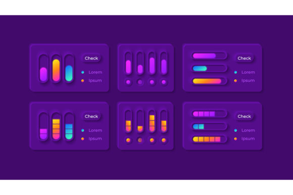
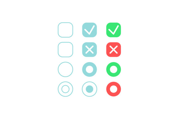
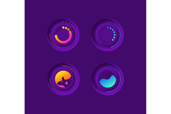
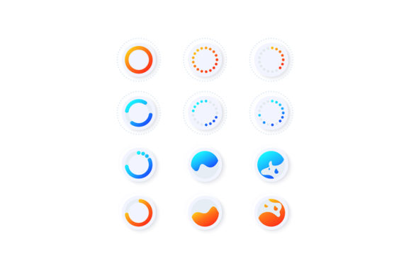
The Progression UI Elements Kit is a specialized collection of vector icons and interface widgets designed primarily to communicate status and data flow within mobile applications and web platforms. Unlike general-purpose icon packs that cover a broad spectrum of categories, this kit focuses intensely on the mechanics of progression. Its primary constituents include isolated vector icons for loaders, progress bars, and comprehensive dashboard templates. These elements are crafted with a light theme interface, ensuring they integrate seamlessly into modern, clean design systems that prioritize readability and minimalism.
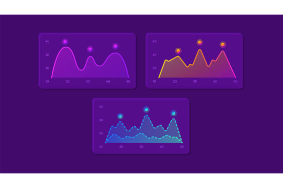
The inclusion of dashboard templates distinguishes this kit from simple icon sets. While a standard loader icon indicates that a process is ongoing, the dashboard components provide a structural framework for displaying complex data sets. This allows designers to maintain visual consistency between the micro-interactions (like a spinning loader) and the macro-layouts (like a user analytics screen). The cohesive nature of these elements reduces the friction often encountered when mixing assets from different sources, which can lead to inconsistencies in stroke weight, color palette, and overall style.
Technical Specifications and File Flexibility
A critical factor in selecting any design asset is the versatility of its file formats. The Progression UI elements kit addresses this by providing a ZIP file containing EPS, JPG, PNG, SVG, and AI formats. This diverse range ensures compatibility across various stages of the design and development pipeline.
- AI and EPS: These vector formats are essential for designers using Adobe Illustrator. They allow for infinite scalability and easy modification of paths, colors, and strokes, making them ideal for the initial design phase.
- SVG: Scalable Vector Graphics are crucial for web and mobile development. They offer small file sizes and crisp rendering on all screen densities, making them the preferred choice for implementing loaders and icons directly into code.
- PNG and JPG: Raster formats are included for quick previews, presentation mockups, or scenarios where vector support is limited. The inclusion of isolated PNGs with transparent backgrounds facilitates rapid prototyping in tools like Figma or Sketch.
The availability of both source files (AI/EPS) and web-ready formats (SVG/PNG) suggests that this kit is intended for end-to-end usage, from high-fidelity mockups to final production deployment. This eliminates the need for additional conversion steps, which can sometimes introduce errors or degrade quality.
Benefits for Mobile and Web Projects
For teams working on mobile applications, the Progression UI Elements Kit offers significant advantages regarding user experience (UX). Loading information is a critical touchpoint; poorly designed loaders can make an application feel sluggish or unresponsive. The vectors in this kit are optimized to be lightweight yet visually engaging, helping to retain user attention during wait times. The light theme interface is particularly relevant for applications aiming for a fresh, airy aesthetic, which is currently dominant in sectors like health tech, finance, and productivity tools.
Furthermore, the dashboard templates provide a head start for projects requiring data visualization. Building a dashboard from scratch involves complex decisions regarding grid systems, spacing, and hierarchy. By utilizing pre-designed templates, designers can focus on customizing the data logic rather than reinventing the layout structure. This can significantly reduce time-to-market for MVPs (Minimum Viable Products) and allow senior designers to dedicate more time to solving unique user problems rather than repetitive UI tasks.
Considerations and Potential Tradeoffs
While the Progression UI Elements Kit offers robust features, it is important to evaluate potential limitations before adoption. The most notable constraint is the exclusive focus on a light theme interface. If your project requires a dark mode or a high-contrast theme for accessibility compliance, you will need to invest time in recoloring and adjusting the assets. While vector formats like AI and SVG make this technically feasible, it does add an extra step to the workflow compared to a kit that includes multiple theme variations out of the box.
Additionally, the specificity of the kit means it is highly specialized. If your project requires a vast library of unrelated icons—such as navigation arrows, social media logos, or e-commerce symbols—this kit will not suffice as a standalone solution. It is best viewed as a supplementary resource to a broader design system rather than a complete replacement for a comprehensive icon library. Users must assess whether their immediate needs center around progression and data display or if they require a more generalized asset pack.
Ideal Use Cases and Alternatives
This kit is a strong fit for specific scenarios. It is particularly valuable for:
- SaaS Dashboards: Projects that rely heavily on displaying real-time data, analytics, and user metrics will benefit immensely from the included dashboard templates.
- Mobile App Onboarding: Applications with complex initialization processes or data syncing requirements can utilize the varied loader icons to provide clear feedback to users.
- Rapid Prototyping: Agencies needing to produce high-fidelity prototypes quickly for client presentations can leverage the pre-made components to demonstrate functionality without building every element from scratch.
However, alternatives may be worth considering if your needs diverge from these use cases. If your primary requirement is a dark-themed interface, you might look for kits specifically marketed as "dark mode ready" or those that offer automatic theme switching capabilities. Similarly, if you are working on a content-heavy website where progression indicators are minimal, a general-purpose UI kit with a broader range of components might offer better value. For developers who prefer coded components over design files, libraries like Material UI or Tailwind UI might provide a more direct integration path, although they may lack the specific artistic flair of custom vector illustrations.
Making the Decision
Selecting the right UI resources is a strategic decision that impacts both design consistency and development efficiency. The Progression UI Elements Kit stands out as a specialized tool for enhancing the visual communication of status and data. Its strength lies in the high quality of its vector assets and the practical inclusion of dashboard templates, all delivered in a versatile range of file formats.
Before downloading, evaluate your project's thematic requirements. If a light, clean aesthetic aligns with your brand identity and your project involves significant data visualization or loading sequences, this kit is likely a worthwhile investment. Conversely, if you require extensive theming options or a broader array of unrelated icons, consider combining this kit with other resources or seeking a more comprehensive suite. By understanding both the capabilities and the constraints of the Progression UI elements kit, you can make an informed choice that enhances your workflow and elevates the final user experience.