Evaluating the Loading Media UI Elements Kit for Modern Dark Theme Interfaces
In the realm of mobile application development and web design, the transition state between user action and system response is critical. When a user uploads a video, streams audio, or waits for high-resolution imagery to render, the interface must communicate progress clearly to prevent frustration. This is where a specialized Loading Media UI Elements Kit becomes an essential asset for designers and developers. Unlike generic spinner libraries, these kits are specifically engineered to handle the nuances of multimedia content, offering visual feedback that aligns with the weight and nature of media files.
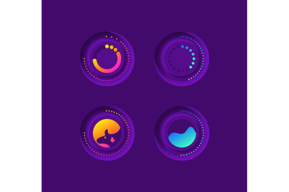
The specific kit in question, characterized by its progression circles, bar indicators, and dashboard templates, offers a comprehensive solution for those working within a dark theme interface. As dark modes have shifted from a niche preference to a standard expectation across iOS and Android platforms, having vector assets optimized for low-light environments is no longer optional—it is a requirement for professional-grade user experience (UX). This article explores the distinct features of this kit, compares it against broader design approaches, and helps you determine if this resource fits your current project needs.
Defining the Scope: What Makes This Kit Distinct
A Loading Media UI Elements Kit is not merely a collection of animated GIFs or CSS snippets. It is a structured library of isolated vector icons and layout components designed to visualize the ingestion and processing of digital media. The distinction lies in the specificity of the elements. While a standard loading spinner indicates that "something is happening," a media-specific loader often incorporates contextual cues, such as file type icons (video, audio, image) integrated into the progress circle or bar.
This particular collection stands out due to its focus on the multimedia upload workflow. It includes:
- Progression Circles: Radial indicators that provide a precise percentage of completion, ideal for circular profile picture uploads or short-form video processing.
- Linear Bars: Horizontal trackers suited for larger file transfers, such as long-form video uploads or batch photo syncing.
- Dashboard Templates: Pre-arranged layouts that show how these loaders integrate into a broader management interface, helping developers visualize the final product.
The inclusion of a dark theme interface as the primary design language is a significant differentiator. Designing for dark mode requires more than inverting colors; it demands careful attention to contrast ratios, glow effects, and saturation to ensure elements remain visible without causing eye strain. This kit addresses those challenges by providing vectors pre-calibrated for dark backgrounds, saving designers the tedious process of adjusting opacity and hue values manually.
Format Flexibility and Technical Integration
One of the most practical aspects of this resource is the diversity of file formats included in the ZIP archive: EPS, JPG, PNG, SVG, and AI. For professionals evaluating design tools, format compatibility is often a deciding factor. Here is how these formats serve different stages of the workflow:
- AI (Adobe Illustrator) & EPS: These are the source files. They are essential for designers who need to modify the stroke width, change the accent colors to match a brand palette, or alter the geometry of the progression circle. Having editable vector sources ensures the kit can evolve with your design system.
- SVG (Scalable Vector Graphics): This is the gold standard for web and mobile implementation. SVGs allow the loading elements to scale infinitely without pixelation and can be directly manipulated via CSS or JavaScript for animation. For a mobile application, using SVGs reduces asset size and improves load times compared to raster images.
- PNG & JPG: While less flexible for code implementation, these raster formats are invaluable for prototyping, creating presentation decks, or using in non-vector-based design tools where quick drag-and-drop functionality is preferred.
When comparing this kit to alternatives that might only offer PNGs or hardcoded Lottie files, the value of having full vector editability becomes apparent. It bridges the gap between static design mockups and dynamic development environments.
Comparative Analysis: Specialized Kits vs. General Libraries
When researching resources for a project, you will likely encounter two main categories: general-purpose UI libraries and specialized media kits. Understanding the trade-offs between them is crucial for making an informed decision.
General-Purpose Libraries: These are vast collections containing buttons, forms, navigation bars, and generic loaders.
Strengths: They offer consistency across an entire application and often include extensive documentation.
Limitations: Their loading indicators are often abstract. They may lack the specific visual cues needed for media-heavy apps, such as thumbnail previews within the loader or specific icons denoting file types. Adapting them for a dark theme might require significant custom CSS work.
Specialized Loading Media UI Elements Kit:
Strengths: These are purpose-built. The progression circles and bars are designed with the timeline of media processing in mind. The dark theme optimization is baked in, ensuring immediate visual harmony. The isolation of vector icons means they can be dropped into any existing design system without carrying unnecessary baggage.
Limitations: They do not provide a full suite of UI components. You cannot build an entire app solely on this kit; it is a supplementary resource meant to enhance specific workflows.
For a project centered around content creation, social media, or cloud storage, the specialized approach of the Loading Media UI Elements Kit usually yields a higher quality result with less development time. However, for a text-heavy news reader or a data-entry form, a general library might be more appropriate.
Design Considerations for Dark Theme Interfaces
Implementing a dark theme interface involves more than aesthetic preference; it impacts usability and battery life on OLED screens. When evaluating whether this kit fits your needs, consider how the provided vectors handle luminance. Poorly designed dark mode elements often suffer from "haloing" or insufficient contrast, making the progress bar difficult to read.
This kit addresses these issues by utilizing high-contrast vectors that stand out against deep gray or pure black backgrounds. The progression circles likely use bright accent colors that maintain visibility without vibrating against the background—a common pitfall in amateur dark mode designs. Furthermore, the dashboard templates included in the kit demonstrate how to arrange these elements alongside other dark-themed components, providing a blueprint for maintaining visual hierarchy.
For mobile applications, where screen real estate is premium, the clarity of these vector icons ensures that users can glance at the screen and instantly understand the upload status, even in low-light environments where the phone is typically used.
Decision Factors: When to Choose This Resource
To determine if the Loading Media UI Elements Kit is the right investment for your workflow, evaluate your project against the following criteria:
- Project Type: Are you building a platform where users frequently upload or stream media? If yes, the specific icons and progress bars in this kit will significantly enhance the UX.
- Design Aesthetic: Is your application utilizing a dark mode or a "night mode" toggle? If so, the pre-optimized vectors will save hours of adjustment time.
- Development Stack: Do your developers work with SVGs and vector assets? If your pipeline supports scalable vectors, the AI, EPS, and SVG files included will integrate seamlessly.
- Customization Needs: Do you require unique branding? The availability of source files (AI/EPS) allows you to tweak the curvature, thickness, and color of the loaders to match your brand identity exactly.
Conversely, if you are building a simple static website, a light-mode-only application, or a project where standard browser-default loaders suffice, this kit may be unnecessary overhead. Similarly, if your team relies exclusively on code-based animation libraries like Lottie and has no capacity to edit vector source files, the value of the AI and EPS formats diminishes, though the SVGs would still remain useful.
Practical Application Examples
Consider a fitness tracking app where users upload workout videos. Using the progression circle from this kit, the app can overlay a sleek ring around the video thumbnail while it compresses and uploads. The dark theme ensures the interface remains easy on the eyes for users checking their stats early in the morning or late at night.
In a cloud storage dashboard scenario, the bar and dashboard template components can be utilized to show the status of multiple simultaneous file transfers. The isolated vector icons can be dynamically swapped to represent PDFs, images, or videos, providing clear context that a generic spinning wheel cannot offer.
Final Verdict on Utility and Fit
The Loading Media UI Elements Kit represents a targeted solution for a specific set of design challenges. It excels in scenarios requiring polished, media-centric feedback loops within dark-themed environments. Its strength lies not in being a comprehensive UI framework, but in being a highly refined specialist tool. The inclusion of multiple file formats ensures longevity and adaptability across different design and development stages.
For professionals aged 20–50 who are actively comparing resources, the key takeaway is efficiency. While one could construct similar loaders from scratch or piece together disparate free assets, the cohesion, dark-mode optimization, and format versatility of this kit offer a streamlined path to a professional finish. It is best suited for teams that prioritize high-fidelity multimedia interactions and wish to avoid the trial-and-error phase of designing effective loading states from the ground up.
Ultimately, the decision rests on the specific demands of your user interface. If your application lives and dies by the smoothness of its media handling, investing in a dedicated kit that addresses progression, clarity, and theme consistency is a logical and strategic move.