Streamline Your Web Design with 18 Navigation Widgets
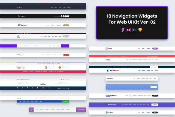
Let's be honest: the navigation bar is often the most neglected part of a website layout until it breaks. We spend hours perfecting hero images, tweaking color palettes, and agonizing over body copy, yet the menu—the actual roadmap for our users—often gets slapped together at the last minute. That is where the 18 Navigations Widgets for Web UI Kit changes the workflow. This isn't just a collection of buttons; it is a curated set of purposeful elements designed to solve the structural headaches of modern web design. Whether you are a seasoned agency owner or a solo entrepreneur launching your first portfolio, having a library of pre-built, pixel-perfect navigation structures can save you dozens of hours per project.
The visual personality of this kit leans heavily into minimalism, but not the sterile kind that feels empty. Instead, it offers a clean, professional aesthetic that prioritizes clarity and ease of use. The widgets are crafted with well-organized layers, meaning you aren't fighting against grouped elements when you try to customize them. In the world of design assets, organization is just as valuable as aesthetics. When you open these files, whether in Photoshop, Figma, Sketch, or Adobe XD, you will find that every stroke, shape, and text layer is named logically. This level of detail signals a respect for the designer's time, allowing you to focus on branding rather than file management.
Versatility Across Four Major Design Platforms
One of the strongest selling points of this UI kit is its format agnosticism. We live in a fragmented design ecosystem where some teams swear by Figma for collaboration, while others prefer the robustness of Adobe XD or the vector precision of Sketch. By including PSD, Figma, Sketch, and Adobe XD files, this kit ensures that no matter what your stack looks like, you can integrate these widgets immediately. There is no need for clumsy conversions or worrying about lost styles during import.
For marketers and content creators who might not consider themselves "designers" but still need to produce high-quality visuals, the editable nature of these files is a game-changer. You can swap out placeholder text, adjust colors to match your brand identity, and resize elements without losing quality. Because the files are Retina Ready, your navigation bars will look crisp on everything from a budget Android phone to a 5K iMac display. This attention to technical detail ensures that your final output maintains a level of professionalism that builds trust with your audience instantly.
It is important to note a crucial distinction regarding the contents: all images, vectors, and mock-ups seen in the preview are for demonstration purposes only. They are not included in the download. This is standard practice for premium design assets, ensuring that the focus remains on the structural components—the widgets themselves—rather than temporary decorative elements. The credits for those preview images belong to their respective authors, a reminder that good design often stands on the shoulders of many creators.
Elevating User Experience Through Structural Clarity
Navigation is more than just a list of links; it is the primary driver of user retention. A confusing menu leads to high bounce rates, while a clear, intuitive structure keeps visitors engaged. The 18 Navigations Widgets for Web UI Kit provides a variety of layouts that cater to different content densities. Some projects require a mega-menu to handle extensive archives, while others need a sleek, centered logo with minimal links on either side. Having eighteen distinct options allows you to test different configurations to see what best serves your specific content strategy.
From a brand identity perspective, consistency is key. Using a cohesive set of navigation elements across your site ensures that users never feel lost. These widgets act as a framework for your modern typography choices. Since the kit utilizes free fonts (with a helpful "Fonts Used" file included in the package to guide you), you can easily replicate the look without incurring extra licensing costs. This is particularly helpful for small business owners and bloggers operating on tight budgets who still want a polished, commercial-grade appearance.
Consider the impact on readability and visual hierarchy. A well-designed navigation widget uses spacing and weight to guide the eye naturally. It distinguishes between primary actions and secondary links without needing loud colors or aggressive animations. By adopting these pre-tested structures, you inherit a level of usability research that has already been baked into the design. You aren't just copying a look; you are implementing a proven method for organizing information that reduces cognitive load for your visitors.
Practical Strategies for Implementation and Customization
Integrating a UI kit like this into your workflow requires a bit of strategy to get the most value. Start by evaluating your project's specific needs before diving into the files. Are you building an e-commerce store that needs prominent cart icons? Or perhaps an editorial blog that requires a distraction-free reading experience? Browse through the eighteen options and shortlist the three that align closest with your goals. Don't be afraid to mix and match elements; the well-organized layers make it easy to take a hover state from one widget and apply it to another.
When customizing, pay close attention to font pairings. While the kit comes with suggestions for free fonts, your specific logo design or headline typeface might require adjustments to the navigation text to maintain harmony. If your brand uses a bold serif font for headings, you might want to pair it with a clean sans serif font in the navigation for contrast and legibility. Test these combinations on actual devices. What looks balanced on a desktop monitor might feel cramped on a mobile screen. The responsive nature of these widgets helps, but always verify the touch targets are large enough for thumbs.
For those working in editorial design or packaging design who are expanding into digital, remember that web navigation has different constraints than print. There is no "page turn"; there is only scrolling and clicking. Use these widgets to create a sense of place. A sticky header, for instance, can keep your navigation accessible as users scroll through long-form content, improving the overall reading experience. For social media graphics or digital ads that link to your site, ensure the landing page navigation matches the promise made in the ad creative. Consistency between the click and the arrival point reduces friction and increases conversion rates.
Finally, always review the licensing terms if you are using this for commercial client work. While the fonts included are free, the UI kit itself is a premium asset designed to streamline your production. Treat it as an investment in your efficiency. By reducing the time spent on repetitive layout tasks, you free up mental energy for higher-level strategic thinking—like how to better serve your audience or refine your message. The 18 Navigations Widgets for Web UI Kit is more than just a download; it is a toolkit for building better, faster, and more reliable web experiences.