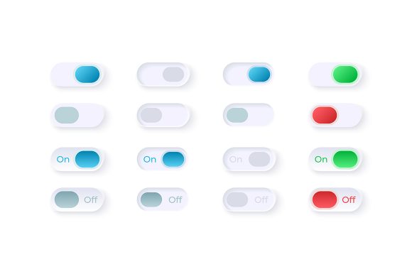
Elevate Your UI with the On and Off Switches Kit
In the fast-paced world of digital product design, the difference between a frustrating user experience and a seamless one often comes down to the smallest details. We spend hours perfecting layout grids, selecting typography, and curating color palettes, yet we frequently underestimate the power of micro-interactions. Among these, the humble toggle switch stands out as a critical communication tool between your application and the user. This is where the On and off Switches UI Elements Kit becomes an indispensable asset for designers who refuse to compromise on quality or efficiency.
At its core, this collection is more than just a set of graphics; it is a comprehensive solution for modern interface challenges. Whether you are building a complex dashboard for enterprise software or a sleek mobile app for consumers, the need for clear, intuitive power settings and option sliders is universal. The kit provides a ready-to-deploy library of vector icons and widgets that solve the "reinventing the wheel" problem. Instead of spending valuable billable hours drawing rounded rectangles and calculating shadow offsets, you gain immediate access to a polished, professional-grade system.
Precision Engineering for Modern Interfaces
The standout characteristic of the On and off switches UI elements kit is its versatility across different file formats. Design workflows vary wildly from team to team. Some professionals live in Adobe Illustrator, others rely on Sketch or Figma, and developers often need raw SVG code for direct implementation. By including EPS, JPG, PNG, SVG, and AI files in the ZIP package, this kit ensures compatibility with virtually any workflow. You can drag and drop a PNG for a quick mockup presentation or dive into the AI file to tweak the bezier curves for a custom brand adaptation.
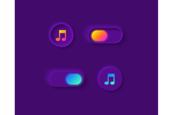
Visually, the collection leans heavily into a light theme interface, which remains the dominant standard for productivity tools, health apps, and financial dashboards. Light themes reduce eye strain during prolonged use and convey a sense of cleanliness and transparency. The switches in this kit are not flat, lifeless buttons; they utilize subtle gradients, soft shadows, and precise spacing to create depth. This tactile quality invites interaction. When a user sees a switch that looks like it can be physically flicked, they understand its function instantly without needing a tooltip or instruction manual.
Real-World Applications Across Industries
The utility of this widget collection extends far beyond simple binary choices. Consider the diverse environments where these elements shine:
- SaaS Dashboards: In administrative panels, users constantly toggle features on and off. A clear visual distinction between active and inactive states prevents configuration errors.
- Mobile Applications: Screen real estate is premium. These isolated vector icons are optimized for touch targets, ensuring they are easy to hit with a thumb on smaller devices.
- IoT Control Panels: For smart home interfaces, the metaphor of a physical switch is powerful. It bridges the gap between the digital command and the physical action of turning on a light or locking a door.
- Educational Platforms: Teachers and students managing course settings benefit from interfaces that feel approachable and non-intimidating.
For entrepreneurs and business owners, the value proposition is equally compelling. Time is money. By integrating a pre-made bar and dashboard template element, you accelerate your time-to-market. You aren't just saving design time; you are reducing the back-and-forth between designers and developers. When the assets are standardized and clean, the implementation phase is smoother, resulting in fewer bugs and a more consistent final product.
Enhancing Usability and Brand Perception
Usability is not just about function; it is about trust. A sloppy interface suggests a sloppy product. Conversely, a refined set of controls signals attention to detail. The On and off Switches UI Elements Kit helps elevate the perceived value of your software. When users interact with high-quality components, they subconsciously attribute that quality to your entire brand. This is crucial for freelancers and agencies looking to build a portfolio that commands higher rates.
Furthermore, consistency is key to good User Experience (UX). If your login button has a specific shadow radius but your settings toggle does not, the interface feels disjointed. This kit provides a unified language. The stroke weights, corner radii, and color transitions are harmonized. This consistency aids cognitive load reduction; users don't have to relearn how to interact with different parts of your app. They learn once, and the knowledge transfers across the entire interface.
Practical Considerations for Implementation
While the assets are ready to use, successful integration requires a strategic approach. Here are a few recommendations for getting the most out of this collection:
- Accessibility First: Ensure that the visual state of the switch is accompanied by proper ARIA labels in your code. While the visual design in the kit is clear, screen readers need text equivalents to describe the state change.
- Color Adaptation: Although the kit features a light theme, the vector nature of the files means you can easily recolor them to match dark mode requirements or specific brand guidelines. The SVG format is particularly robust for this, allowing CSS variables to control fill and stroke colors dynamically.
- Contextual Sizing: Do not simply scale the icons up or down without checking legibility. What works on a desktop monitor might be too small for a mobile finger tap. Use the provided variations to choose the right size for the specific context.
- State Clarity: Make sure the "On" and "Off" states are distinct not just by color, but potentially by position or iconography if your audience includes users with color vision deficiencies.
For marketers and content creators, these visuals also serve a purpose in promotional materials. High-fidelity screenshots of your app featuring crisp, professional UI elements convert better in landing pages and ad creatives. They signal to potential customers that your product is mature and reliable.
The Bottom Line for Creators
In an industry saturated with generic templates, finding a resource that balances aesthetic appeal with technical practicality is rare. The On and off Switches UI Elements Kit delivers exactly that. It respects the intelligence of the end-user by providing clear, intuitive controls, and it respects the time of the creator by offering a flexible, high-quality toolkit.
Whether you are a hobbyist building your first app or a seasoned agency director overseeing a major platform overhaul, the fundamentals of good design remain the same: clarity, consistency, and care. By leveraging specialized resources like this, you free up your mental energy to focus on the bigger picture—solving user problems and creating value. The switch itself is small, but its impact on the overall user journey is profound. Investing in quality UI elements is not an expense; it is a strategic move toward building better digital products.