Mastering Modern Web Design: A Deep Dive into Blog Post Widgets UI Kits
In the rapidly evolving landscape of web design, the difference between a website that merely functions and one that truly engages often lies in the details. For designers, developers, and business owners alike, the pressure to deliver high-quality, visually stunning interfaces within tight deadlines is immense. This is where the concept of a Blog Posts Widgets for Web UI Kit becomes not just a convenience, but a strategic necessity. Whether you are building a personal portfolio, a corporate news hub, or a massive e-commerce content engine, understanding how to leverage pre-designed user interface elements can transform your workflow.
This article explores the significance of these specialized UI kits, breaking down their components, file formats, and practical applications to help you build a broader understanding of modern digital asset management and design efficiency.
The Foundation: What Are Blog Post Widgets?
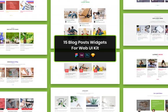
At its core, a widget in web design is a self-contained unit of functionality or information that can be embedded into a webpage. When we specifically talk about blog post widgets, we are referring to the modular components used to display articles, news updates, or case studies. These are not just simple text blocks; they are complex arrangements of typography, imagery, metadata (like dates and authors), and interactive elements like "Read More" buttons.
A dedicated UI Kit for these widgets provides a library of these pre-designed modules. Instead of starting from a blank canvas every time you need to design a new section for a blog archive or a featured article, you have a toolkit of purposeful elements ready to deploy. This approach shifts the designer's focus from reinventing the wheel to curating the best possible user experience.
Why Minimal Design Matters
One of the standout features of high-quality UI kits today is their adherence to minimal design principles. In an era where users are bombarded with information, clarity is king. A minimal design strips away unnecessary decorations, focusing on whitespace, legible typography, and clear visual hierarchies.
When a UI kit boasts a minimal aesthetic, it ensures that the content itself takes center stage. For blog posts, this means the reader's eye is naturally drawn to the headline and the featured image, rather than being distracted by cluttered borders or excessive shadows. This style is not only aesthetically pleasing but also functionally superior, as it tends to load faster and adapts more gracefully to different screen sizes.
The Power of Versatility: Multiple File Formats
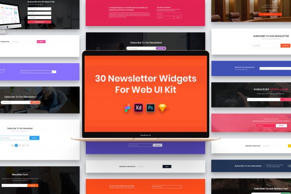
The modern design ecosystem is fragmented. Some teams swear by Adobe Photoshop, others have migrated entirely to Figma, while legacy projects might still rely on Sketch or Adobe XD. A robust UI kit recognizes this diversity and offers comprehensive compatibility. The inclusion of PSD, Figma, Sketch, and Adobe XD files in a single package is a game-changer for collaboration.
- Figma: Ideal for real-time collaboration and cloud-based workflows, allowing multiple designers to work on the widget library simultaneously.
- Sketch: A favorite among Mac users for its lightweight nature and extensive plugin ecosystem.
- Adobe XD: Perfect for those deeply integrated into the Adobe Creative Cloud suite, offering smooth transitions between design and prototyping.
- PSD (Photoshop): The industry standard for detailed image manipulation and complex layer effects, ensuring no detail is lost for traditionalists.
Having access to all four formats means that regardless of your team's preferred toolset, you can integrate these widgets seamlessly into your existing workflow without the need for risky file conversions that often break layers or alter styles.
Organization and Editability
Possessing the files is one thing; being able to use them efficiently is another. A common frustration with free or low-quality resources is disorganized layer structures. You might open a file to find hundreds of unnamed layers grouped haphazardly, making customization a nightmare.
Premium UI kits prioritize well-organized layers. Every element, from the background card to the tiny social share icon, is named logically and grouped intuitively. This structure makes the files easily editable. Need to change the corner radius of every card in the kit? With organized components, this can be done globally in seconds. Need to swap out the font weight for all headings? A well-structured file allows you to do this without hunting through dozens of individual text boxes.
Technical Excellence: Pixel Perfect and Retina Ready
In the world of high-resolution displays, "good enough" is no longer acceptable. Screens on smartphones, tablets, and laptops have become incredibly dense. A design that looks crisp on a standard monitor might appear blurry on a Retina display if not handled correctly.
Top-tier UI kits are pixel perfect and retina ready. This means the vectors and assets are created at resolutions that ensure sharpness on any device. When you export assets from these kits, they maintain their clarity, ensuring your brand looks professional regardless of the user's hardware. This attention to technical detail builds trust with your audience; a blurry interface often subconsciously signals a lack of care or professionalism.
Typography and Fonts
Typography is the voice of your design. The choice of font can dictate whether a blog feels authoritative, playful, or elegant. Many UI kits come with free fonts or specify exactly which typefaces were used to achieve the desired look.
It is important to note a common misunderstanding regarding font licensing. While the UI kit file will show you the design using specific fonts, the font files themselves are rarely included in the download due to licensing restrictions. Instead, reputable kits provide a "Fonts Used" file or a link within the documentation. This directs you to the official source (such as Google Fonts or Adobe Fonts) where you can legally download or sync the typefaces. This practice respects the intellectual property of type designers while ensuring you have access to the exact tools needed to replicate the design.
Practical Relevance in Business and Education
How does this fit into the real world? Consider a marketing agency tasked with launching a content hub for a client in the education sector. They need to present complex research papers in a digestible format. Using a creative and professional design UI kit, they can instantly prototype a layout that uses clear cards for abstracts, bold headers for titles, and distinct tags for subject matters.
Similarly, in the business world, speed to market is critical. If a startup needs to launch a company blog to improve their SEO and establish thought leadership, building a custom design system from scratch could take weeks. By utilizing a fully customizable widget kit, they can reduce this timeline to days. The fully customizable nature of these kits allows the startup to apply their brand colors and logo immediately, creating a unique identity without the heavy lift of foundational design work.
Clarifying Usage Rights and Assets
When downloading and using these resources, it is vital to understand what is included. A frequent point of confusion involves the images and mockups seen in the preview screenshots.
Note: All images, vectors, and mock-ups displayed in the promotional materials are typically used for preview purposes only and are not included in the actual download files. These placeholders are meant to demonstrate how the widgets look when populated with content. The credits for these preview images go to their respective authors. When you begin your project, you will replace these placeholders with your own photography, illustrations, or stock assets that align with your specific content strategy.
Building a Broader Understanding of Design Systems
Ultimately, using a Blog Posts Widgets UI Kit is about more than just saving time; it is about adopting a systematic approach to design. It teaches the value of consistency, reusability, and modularity. By working with purposeful elements, designers learn to think in terms of systems rather than isolated pages.
This mindset is crucial for scalability. As your website grows from ten blog posts to ten thousand, having a standardized set of widgets ensures that the user experience remains consistent. It simplifies maintenance for developers, who can code a single component and reuse it across the entire site, reducing bugs and improving performance.
Conclusion
The transition from manual, pixel-by-pixel design to leveraging sophisticated UI kits represents a maturity in the web design industry. A 15 Blog Posts Widgets for Web UI Kit containing PSD, Figma, Sketch, and Adobe XD files offers a powerful foundation for anyone looking to create impactful digital experiences.
By combining minimal design aesthetics with well-organized technical structures, these kits empower creators to focus on what truly matters: the content and the message. Whether you are a beginner looking to understand the mechanics of web layouts or an experienced professional seeking to streamline your pipeline, embracing these tools is a step toward more efficient, beautiful, and effective web development. Remember to respect licensing terms regarding fonts and preview images, and you will find that these resources are invaluable allies in your creative journey.