Boost Conversions with 25 Call to Action Widgets
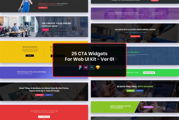
In the fast-paced world of web design, the difference between a visitor leaving your site and becoming a loyal customer often comes down to a single element: the call to action. Whether you are building a landing page for a new startup, refreshing an e-commerce store, or designing a portfolio, guiding users toward the next step is critical. The 25 Call to Action Widgets for Web UI Kit offers a streamlined solution to this common challenge, providing a collection of purposeful elements designed to enhance user engagement without sacrificing aesthetic appeal.
This resource is not just a bundle of graphics; it is a functional toolkit containing twenty-five distinct widget designs available in four major file formats: PSD, Figma, Sketch, and Adobe XD. Each file features well-organized layers, ensuring that designers of all skill levels can dive in and start customizing immediately. The kit emphasizes a minimal design philosophy, stripping away unnecessary clutter to focus on clarity and conversion. Because the files are pixel-perfect and retina-ready, the final output looks crisp on any device, from high-density mobile screens to large desktop monitors.
Why Designers and Developers Choose This Kit
The value of a UI kit varies significantly depending on who is using it. For a seasoned professional working at a digital agency, time is the most expensive commodity. They need assets that integrate seamlessly into existing workflows without requiring hours of cleanup. The 25 Call to Action Widgets for Web UI Kit addresses this by offering fully customizable and easily editable files. A senior designer can open the Figma or Sketch file, adjust the vector shapes to match a client's brand guidelines, swap out the typography using the included free fonts, and have a high-fidelity mockup ready for presentation in minutes.
Conversely, for beginners or hobbyists learning the ropes of interface design, this kit serves as an educational tool. By examining the well-organized layers, a novice can understand how professional components are constructed. They can see how shadows are applied, how gradients are layered, and how text hierarchy is established within a button or banner. This transparency turns the download into a learning opportunity, allowing less experienced users to deconstruct professional work and apply those lessons to their own projects.
Tailored Benefits for Different Creators
Entrepreneurs and small business owners often wear multiple hats, acting as both the CEO and the marketing department. For this group, the priority is often speed and reliability. They may not have the budget to hire a dedicated UI designer for every minor update. With this kit, a business owner can quickly deploy a new "Sign Up" or "Buy Now" section that looks polished and trustworthy. The minimal design ensures that these widgets do not clash with existing site themes, providing a cohesive look that builds consumer confidence.
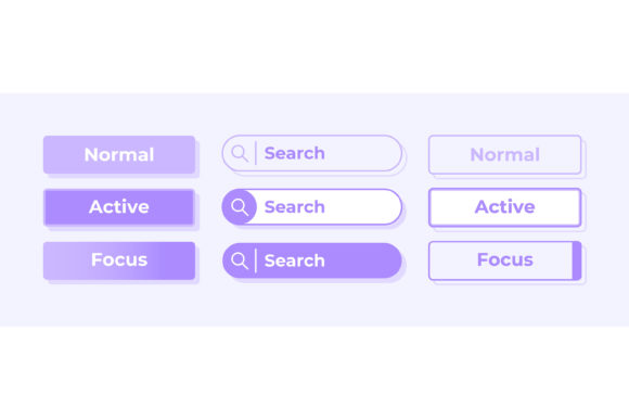
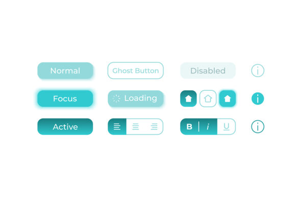
Marketers and bloggers, on the other hand, focus heavily on conversion rates and A/B testing. They need elements that stand out enough to be clicked but remain subtle enough not to annoy the user. The variety within the twenty-five widgets allows marketers to test different styles—perhaps a ghost button versus a solid fill—to see which drives more engagement. Since the images, vectors, and mock-ups included in the preview are for demonstration purposes only, users are encouraged to insert their own compelling copy and relevant imagery, ensuring the message aligns perfectly with their specific campaign goals.
Educators and publishers might use these widgets to structure course landing pages or newsletter subscription areas. The clean, professional design helps maintain authority and readability. When an educator presents a course, the call to action needs to feel inviting rather than aggressive. The purposeful elements in this kit strike that balance, offering clear visual cues that guide students toward enrollment without feeling like a hard sell.
Technical Flexibility and File Formats
One of the strongest arguments for adopting this specific UI kit is its compatibility across the industry's standard tools. Whether your team collaborates in Figma for real-time editing, relies on Adobe XD for prototyping, uses Sketch for macOS-based design, or maintains legacy projects in PSD, this kit has you covered. This flexibility eliminates the friction of file conversion, which can often distort layers or break vector paths.
The inclusion of free fonts is another practical detail that adds value. Designers do not need to hunt for licensing information or purchase additional typefaces to make the widgets work. The download package includes a "Fonts Used" file with direct links, streamlining the setup process. However, it is important to note that while the design files are comprehensive, the specific photos and complex vector illustrations seen in promotional previews are not included. This distinction encourages creators to inject their own brand identity into the widgets, preventing the "cookie-cutter" look that can occur when everyone uses the same stock assets.
Making the Right Choice for Your Project
Before integrating any new asset into your workflow, it is essential to evaluate if it matches your project's scope. If you are building a highly experimental, avant-garde website that relies on heavy animation and 3D interactions, a minimal widget kit might serve only as a starting point rather than a final solution. However, for SaaS platforms, corporate websites, e-commerce stores, and personal portfolios where clarity and usability are paramount, these widgets are an excellent fit.
Freelancers will find particular value in the commercial potential of this kit. By reducing the time spent on designing repetitive UI elements, freelancers can take on more clients or dedicate more time to strategic planning and user research. The ability to deliver high-quality, retina-ready designs quickly enhances a freelancer's reputation for efficiency and professionalism.
Ultimately, the 25 Call to Action Widgets for Web UI Kit is about removing barriers between an idea and its execution. It provides a solid foundation of creative and professional design elements that can be adapted to countless scenarios. Whether you are a student practicing layout principles, a developer looking for quick styling references, or a business owner trying to improve sales figures, this resource offers a practical, high-quality path forward. By leveraging these well-organized, fully customizable files, you can ensure that your calls to action are not just seen, but acted upon.